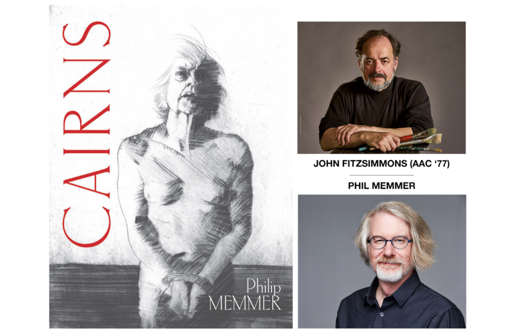
THE CONVERSATION
Art Academy alumni ’77, John Fitzsimmons, recently collaborated with poet Phil Memmer on the writer’s new book, Cairns – a book-length poem sequence that imagines a conversation between the mythical figure Sisyphus, and the rock he is sentenced to roll eternally uphill. I asked both artist and poet to share their thoughts about bringing Cairns into the world, and on the nature of their working relationship. Here is what they said:
What was the inspiration for Cairns, and how did you go about beginning to write the book? Were there outlines, notes, etc. – or did you just start with the first words and work your way forward?
Phil: I was interested in writing about the afterlife. The three books I completed before Cairns all dealt with religious mythologies in various ways, but somehow the idea of the afterlife only came up occasionally, and in small ways — never as the focus. That omission fascinated me, and as I began thinking about what I might do, I found myself thinking about Sisyphus (along with Tantalus and Charon, who I hope to work with in the future).
Moving from “thinking about something” to actually writing it, for me, involves a journey. Usually, a long and quite literal journey: lots of early morning walks — in this case for much of two years — listening for the right music, the right doorway into the material. In the case of Cairns, it was initially a matter of discovering the stone as a potential character, a second voice; the second important discovery was the syllabic form that I used for the poems. From there, it was a matter of just exploring and playing. A few notes here and there, but no outline.
When Phil approached you to create the illustrations for Cairns, how did you move forward with the project? Did the graphic concepts come as you were reading the manuscript, or did you wait until finishing the text to consider what images would find their way into the final work?
John: When Phil proposed this project, I immediately said yes, and even before reading his draft, I knew the direction I wanted to go in.
I had been looking for a project like this for several reasons. One was exploring the “narrative,” which I have always found challenging. This coincidently goes way back almost 50 years ago to the Art Academy. Back then, the modernist philosophy was that narrative is kitsch, and thus not serious, and to be avoided at all costs. I have been processing this conflict and wanted a project to push me forward with this exploration. The other was to have a theme for a series of intaglio prints.
When I attended the Art Academy in the early 70s, it had a great foundation program that required extensive exposure to all fields. Of course, the Art Academy was well known for illustration, but I had it in my head that the last thing I wanted was to be an illustrator and was afraid that if I had developed any skill in that direction, I would get stuck there. So, I did my best to avoid taking the last illustration course that was required until the final semester when Gerry McDonald told me that couldn’t graduate without it. So, for the only time in 4 years, I gave the minimum effort to a course [sorry Barron Krody] and “got by” and thus I do not qualify as an illustrator.
I have been re-learning intaglio printing and built my own press and figured out electro-etching for metal plates and plastic dry-point, and I wanted a challenge to push myself forward. I saw that the loose inky images I have been making would be ideal to use for these illustrations. At the Art Academy, I took printmaking from April Foster and was attracted to the possibilities of combining drawing with the painterly mess of ink on plates. In the mid-70s, the art museum had a show of Louise Nevelson’s lithographs that were made by applying multiple layers of tusche-soaked cheese cloth to the stone. The prints were black on black on black and were quite beautiful and I often think of them.
In regard to the graphic concepts: this goes back to my conflicts with narrative. I didn’t want to provide images that illustrated specific parts of the poem. Instead, I thought of this as a parallel effort. I do admit that this is a bit of a dodge because I tend to overthink the translation from verbal to imagery and found it very hard to make an image I was satisfied with. On the other hand, I want to keep images open, which means I want to leave them open to some free association.
In this context, free association does not mean automatic writing or Rorschach ink blots, both of which by nature are intended to be un-linked to any pre-determined meaning and to allow the viewer to insert their own meaning. In regard to my work, I claim that I am looking for the “non-verbal idea” or the idea that can only be expressed visually. So, I am using some free association, this allows the viewer to participate but there is the core “non-verbal idea.” Perhaps you can call it “guided free association.”
What made you decide to make the process of creating this book collaborative, and what about John’s work and style made you think of him as the right fit for adding the illustrative elements to the story?
Phil: The initial impulse to bring artwork into the project was oddly practical: I was concerned that the book felt short. The initial version I sent to the publisher contained 64 poems, each of which is only 44-45 syllables long (the final version contains 72 such poems). In terms of page count, that matches up reasonably with most books of contemporary poetry, but in terms of actual words, it’s very short: the whole book can be read aloud in a half hour. When I mentioned that concern to Christine Holbert at Lost Horse Press, she wondered if we might include artwork (something she had done to great effect in a few previous titles).
Shortly after that conversation—really within a day or two—one of the poems from Cairns was published in an online journal, and I posted a link to it on my Facebook page. John saw the post and asked if I might be interested in collaborating on something. I had long admired John’s paintings, which I’d had the pleasure of publishing on several occasions in the journal Stone Canoe, and knew immediately that his work would be a great fit for the book. I’ve always found his work haunting – exactly what you want for a book set in hell.
What was it about the Phil’s text that made you see the images you wanted to bring to this project? Were there some that did not make it into the final print, and if so, what was the difference between the images you kept and those that were left out?
John: I spent 7 months working on the12 final prints starting from the first conversation to sending off the final images to the publisher. After I had finished several etched plates, I decided to start over because even though I liked the actual prints, I wasn’t happy with their continuity. So, I started over with dry-points done on plexiglass plates and largely re-did the original images.
FYI, the plexiglass drypoint process uses clear acrylic, or PETG plates, that I lay directly over my source drawing, and it is more like continuing than copying the original drawing. I use a variety of tools including modified carbide PCB drill bits. These give more of an engraved line instead of a burr line.
As you were writing Cairns, what aspects or moments pleasantly surprised you?
Phil: I take a particular pleasure in upsetting expectations, in being a little impish. One such moment in the book came about when I first had the impulse to mess with time and bring completely modern elements into the setting of Hades. That particular poem places a ski lift on the slope of Sisyphus’ mountain, because… well, because why not? It’s funny. But that initial humorous impulse led to a rhetorical moment I could not have reached in any other way—without the ski lift, the language that followed would not have been possible.
A similar question: as you were creating the illustrations, were there ideas or qualities that seemed to emerge on their own, that surprised you?
John: When painting or printmaking, I need a balance between having some direction and (moments) that surprise. Like Chuck Close said: inspiration is for amateurs, the rest of us just show up and get to work.
I have an idea and may not know how I am going to get there or even what it’s going to look like, but I know it when I get there and choose to be satisfied.
What was the most rewarding part of this collaboration?
Phil: Not having worked with an artist in this way previously, it was such a delight simply to see how John responded to the work — and also to see how much his vision echoed, but added to, my own. And discussing the work with John, and discussing both of our processes, was also a joy.
John: The challenge of a new direction and working with a master in another medium.
What do you hope readers of the book will take away from Phil’s writing in the book?
John: The humorous universe!
What do you hope readers of the book will take away from John’s illustrations in this book?
Phil: That’s a hard one to answer, as on some level, I only have vague notions of what I want readers to take away from the poems themselves. I’ve done my part, and John has done his, and it’s up to the readers to complete the puzzle. But I hope they appreciate how gorgeously he’s interacted with the poems.
Here is the link on Phil Memmer’s site to order a copy of Cairns.